AIRPORT KIOSKS PROJECT
Overview
Tourism Ministry of Saudi Arabia has been making a lot of changes & progress, since Govt’s plan to develop new revenue sources as future alternatives of Oil Export. This vision enabled huge interest in promoting Tourism in the country. Govt started a number of development projects linked with facilitating tourists & changing perceptions.
Even the name of this Ministry has gone through multiple changes. It started as “Saudi Commission for Tourism & Antiquities | SCTA“, then it became “Saudi Commission for Tourism & Heritage | SCTH“, and now quite recently they have changes it to “Ministry of Tourism“. Over the time, they have changed the Logo quite a few times too. It shows their concern.

I got deployed at Tourism Ministry, by my company, as UI/UX Designer for a Project of Airport Kiosks to facilitate the Tourists on their arrival. The technical aspects of this project were being handled by engineers & developers in the team, and I was responsible for User experience design. In simple words, I was required to make the Kiosk machine’s interface user-friendly for faster & effective guidance of tourists.
User Persona & Story Board
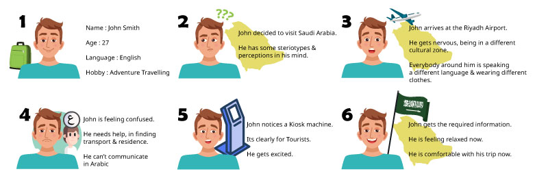
I created a User-Persona & Story Board, to represent the problem & solution, for everyone’s understanding. This way, whole team felt associated with the problem, and my inbox received numerous ideas for solutions. Everyone wanted to help out “John Smith – the tourist”.
First UX Challenge
Before I could get started with the internal Kiosk Screens’ interface, I needed to finalize the First Screen’s content, in a way that attracts or inform maximum tourists about this new facility at airport. I did some research and discussed this challenge with the team, for inputs.
Challenge Statement # 1 :
“How to make sure that the Kiosk machines grab the attention of Tourists & invite them to interact with it?”
I visited some places with Kiosk machines to observe how people respond to this facility, and how do they interact with it. There were multiple observations & suggestions from the team as well.
- OPTION X : We can display some video with beautiful landscapes of the country, or some Image gallery slider, to attract tourists to find out more.
Outcome : Not only the Kiosk machine got ignored by majority of people, but also the ones who interacted with it, were not all tourists. In other words, even locals were interacting with the machine, out of curiosity. - OPTION Y : Instead of some Video or Gallery, we can display Large Bold text on First screen stating something like “Digital Tourist Guide” to attract the right audience & clarity of purpose.
Outcome : It did solve the problems associated with Option X. But screen size of Kiosk machine is not large enough to attract attention. Moreover it added more steps for a User, to achieve a target, using that machine. - OPTION Z : Instead of putting Invitation on the screen, we can write those statements on a separate banner or board, that can be placed above or beside our Kiosk machine.
Outcome : It literally turned out to be an “Out of Box” solution, that satisfied all of our concerns. It helped in highlighting the facility, without adding additional steps for user. In addition, we got free from the boundary of Kiosk screen size, to attract the attention of tourists.

Second UX Challenge
Selection of Services being offered at Kiosk machine, was the 2nd Challenge. I needed to finalize the services we were going to offer to Tourists, so that I can design the interface accordingly. In order to do this, we conducted some interviews & surveys.
Challenge Statement # 2 :
“What do the tourists want to know? What services can be offered by Kiosk Machine?”
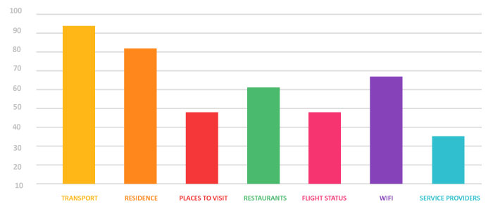
I created a basic questionnaire, and a priority list for the participants. So that they can pick a order for all services, from most important to least one. It helped us a lot, in finalizing the services which are most important for the tourists at airport. We used email broadcasting & face to face interviews to evaluate the choice of services. Majority of the tourists were interested in “Transport”, then came “Residence”, then “Places to Visit” and then “Restaurants” etc.
Third UX Challenge
Once we finalized the services, offered by Kiosk machine. I immediately started making some wireframes & sitemaps, to demonstrate the User-Flow. Our Goal was pretty clear. We wanted to keep things simple & quick. No extra steps, No complications. Also, we intended to keep user-navigation as smooth as possible.
Challenge Statement # 3 :
“What interface can keep things easy & quick for users?”
I decided to design some interfaces, with large sized blocks with icons of services. My intention was to facilitate readability & accessibility. Sitemaps were passed on. Some changes were asked. And we shortlisted 3 Models in the end.

- OPTION A : First prototype was pretty basic. A series of large blocks with services’ names & icons. A header menu on the top, like a website.
Feedback : This interface was compromising readability of important features mentioned in header menu. - OPTION B : To accommodate the feedback of Option A, I added a Side-Bar with more space for text-size & faster accessibility.
Feedback : It did solve the previous concern, but what about Saudi Arabia’s identity? Its branding? As we did not displayed country’s culture or landmarks in first screen to skip an extra step. - OPTION C : This time, I added a slider on the top, for a slider, to display Saudi Arabia’s culture & landmark videos/photographs.
Feedback : That’s perfect. Lets proceed!

More details may be updated later ….
