LINKSLINE PROJECT
Overview
LinksLine company is an IT Solutions provider in Riyadh, KSA. It has been working with several Government Ministries on a number of projects for many years. Being an old and trusted partner of Govt. Sector with countless clients, the company never struggled to score projects for its business. Therefore it never felt the need to advertise or appear trendy, until recently when the management noticed that this ignorance is making space of approval for LinksLine’s competitors.
Therefore, a Brand Makeover was required in order to catch up with the modern trends. LinksLine hired me for this Re-branding, in addition to be deployed at GCS Ministry for another Project.
Challenges
My research concluded 3 major challenges which were required to be dealt with during this brand update.
- Outdated brand and web interface which lacked responsiveness and mobile view. Old fashioned brand elements and print media.
- To Re-Brand a well-known IT company which has large number of clients, I had to evaluate the scope of change so that everyone could still recognize the original Brand after its makeover. This restricted the creative possibilities to limited and well-calculated ideas.
- Updating the Brand face, with modern trends, to boost company’s chances of getting projects, and to keep existing clients interested. Because having an old fashioned look may cause some clients moving towards modern looking competitors.
Research
During the research phase, I sought to understand the current state of company’s website and brand profile. My intention for the research phase was to uncover the areas that were lacking the modern appearance and functionalities. I wanted to better understand all factors which were influencing the decisions of clients.
Competitive Analysis
I analyzed some of Linksline’s competitors in the Govt IT sector. I uncovered the strengths and weaknesses of direct competitors. My competitive analysis produced the following insights:
1. Social Media Integration
Other IT Solution providers had already joined the social media world, and were regularly updating their profiles for their existing and potential clients. Linksline urgently needed to utilize this medium of interaction. This would help out Linksline, not only in sharing information about their services but also in engaging clients for quick feedback.
2. Device Compatibility
Linksline website and web portals were not responsive and lacked device compatibility. On the other hand, majority of its competitors realized this need much earlier and adjusted their web portals for mobile users. Linksline also needed to work on Mobile user experience on top priority.
3. Look & Feel
One of most prominent difference between Linksline and its competitors was the first impression of their web profile. Linksline was still appearing as some old fashioned company which had not made any change on its website for many years. Competitors were attracting more clients with their fresh and modern presentation.
4. Communication Gap
Linksline was failing to deliver proper and quick information about its business, services and projects to its potential clients. Moreover existing clients were not getting any response to their contact form submissions, instead they were left with no other option except visiting office or phone call to some manager. Two of Linksline competitors used creative info-graphics and diagrams to showcase their services.
Surveys and Interviews
In order to design a brand profile with a great user experience, I had to first identify the preferences of the target audience. To understand the perspective of users, I consulted them directly.
1. In-House Users
I sat down with Linksline Team of Web Developers to ask them about their concerns about how much change they can afford to handle, without disrupting the on-going services. Similarly I interacted with the Sales and marketing team to note down their investments in the existing design. So we can make calculated updates without damaging their brand identity. Because our main goal was to Improve the existing brand, and not to create a new one.
2. Clients’ Input
I took input from some clients directly, and sent out emails and surveys to remote clients. They were requested to share their views, preferences, choices and suggestions. This exercise not only provided us with several suggestions but also highlighted some problems related with user experience. As a bonus, it also made our clients feel that we care. I documented all results, and merged them into actionable report.
Solutions
Now that I had interacted with target users and identified their concerns, I decided to define the solution. Balancing conflicting business goals and user needs is one of the biggest challenges a designer may face. You may feel being pulled in too many directions and consequently end up not doing justice by your users. I reflected on the corporate objectives, user goals, and technical considerations to find a sweet spot for all stakeholders. Once I identified common goals, I was able to decide what steps and features were necessary for the prototype.
- Brand Identity (Modified Update, with few key brand elements to be preserved for identification)
- Website (A completely new website, based on latest trends, technology and features)
- New Content (For print and screen media, to deliver all important information effectively)
- Social Media Integration (Under supervision of Marketing team)
- Info-graphics and Service Task flow diagrams (Defining each service and product creatively)
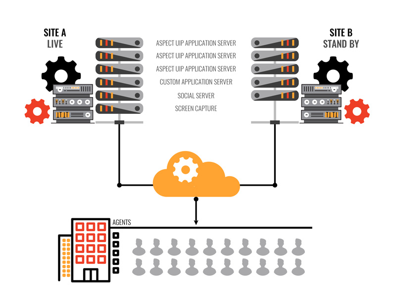
Services Task Flow
I studied each service provided by LinkLine and designed informative technical diagrams to summarize its task flow to make it easier for users to understand how it works. I completed a task flow and user flow to imagine the ways a user might navigate through the website to understand different services. It allowed me to ensure that the information was organized in a way that is intuitive to the clients as well as helpful for marketing team to advertise that information smartly. I have showcased few diagrams as samples.


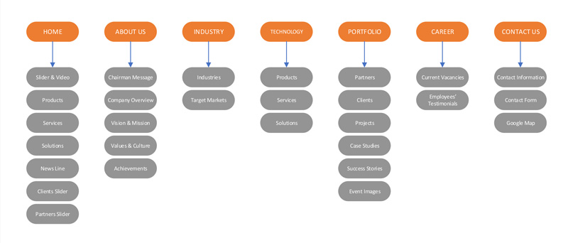
Website Sitemap
I created a list of site features to further define and guide the vision for the web profile. Prioritizing the features with supporting research created a clear order of execution. Based on response trends and competitive analysis, I created a site map which laid out the structure and organization of the content on the website.
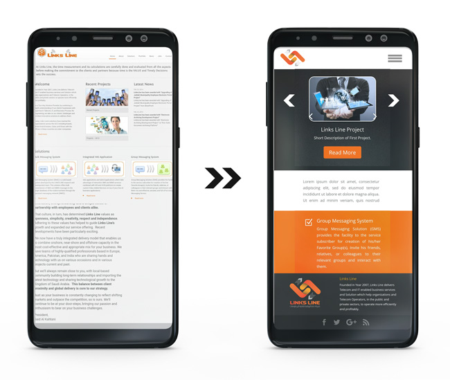
User Interface Design
As decided, I designed a new website from scratch to replace the existing old fashioned one. Existing website had static boxed layout. New one was built on modern platform and included responsiveness and device compatibility. I have showcased the transition in Prototype stage.

Device Compatibility
Another target was to develop device compatibility for mobile user experience. In addition to content adjustments for different screen devices, I also noticed the need for some content replacement in several areas. I used CSS strategies to switch between content for users of smaller screens.
Brand Identity Update
It was the most sensitive modification, as Company wanted a New Logo for its brand identity but also defined “New” as “Fresh”, not “Different”. After quite some discussion, we agreed on a scope of change with following notes :
- There will be 2 major options. First one to be a Modern alternative of existing logo.
- Second option will offer a different look yet maintaining the existing color scheme and font for the name of company. In other words, I will just replace the Logo Icon, not the colors or fonts.
Final Selection
As decided, two logos were proposed. The first option was a modern alternative of existing one. However the 2nd option of new logo was picked, because it provided me the space for adding meaning to each element. I picked 2 Ls from the name LinksLine and rotated those to form a geometric link. Some arrows were added to represent messaging services of the company, while dots represented the bulk messaging service.
Color scheme and font were kept similar to existing one, to maintain some identity. However this time, the colors were tested for both white and dark backgrounds. I have shown the main factors involved in selection of 2nd option below.
Conclusion
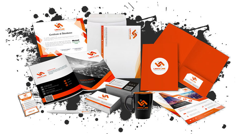
Similar methods were used for each print media element and all were branded with the new identity. There were multiple challenges in designing each element like business cards, letterheads, envelopes, certificates, stationery, ID cards, Folders, Presentations and screen media banners etc. There was secondary UX research conducted for each element with several creative stories, However I have skipped the secondary details here and shown the end product below.
While the feedback was mostly positive from clients, the management was quite excited over this change. I plan on showing off the rest of the pages of the prototype, provided the permission of the company. I plan to continue the iterative cycle of testing and updating the prototype. This branding project has a special place in my designing experiences.